For making certain elements stand out in a lit environment, such as with accent or task lighting, it is important for the designer to properly build a visual hierarchy that takes into account brightness contrast.
Brightness Contrast Ratio
The Illuminating Engineering Society has studied brightness contrast and found that the human eye doesn’t notice brightness contrast ratios of 3:1 or less. For this reason, it is recommended that contrast ratios between ambient lighting and objects of focus be at least 4:1, with higher ratios being able to draw even more attention to an illuminated object. This natural attraction to the brightest object in a space is what is known as the “moth effect.”
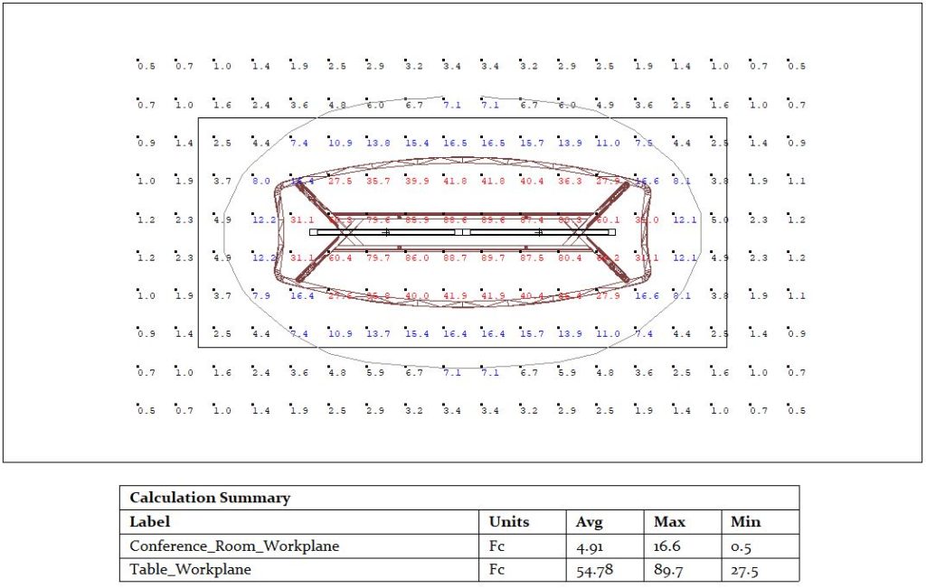
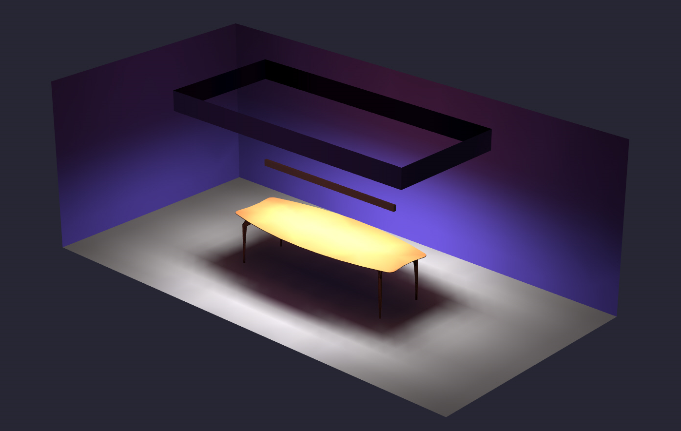
The above workplane calculations show that the table’s calculations (in red) have an average of 89.7 foot-candles, with the outer extremities of the table having 27.5 foot-candles at a minimum. At a 4:1 ratio, areas of lower contrast would need to have 6.875 foot-candles or less; the surrounding space that meets these qualifications is outside the ring of blue calculation values, shown in black.
Artwork and Brightness Contrast
Although artwork can be illuminated with a wallwash with great results, using brightness contrast to further draw attention to a piece can look great in both a gallery and at home.
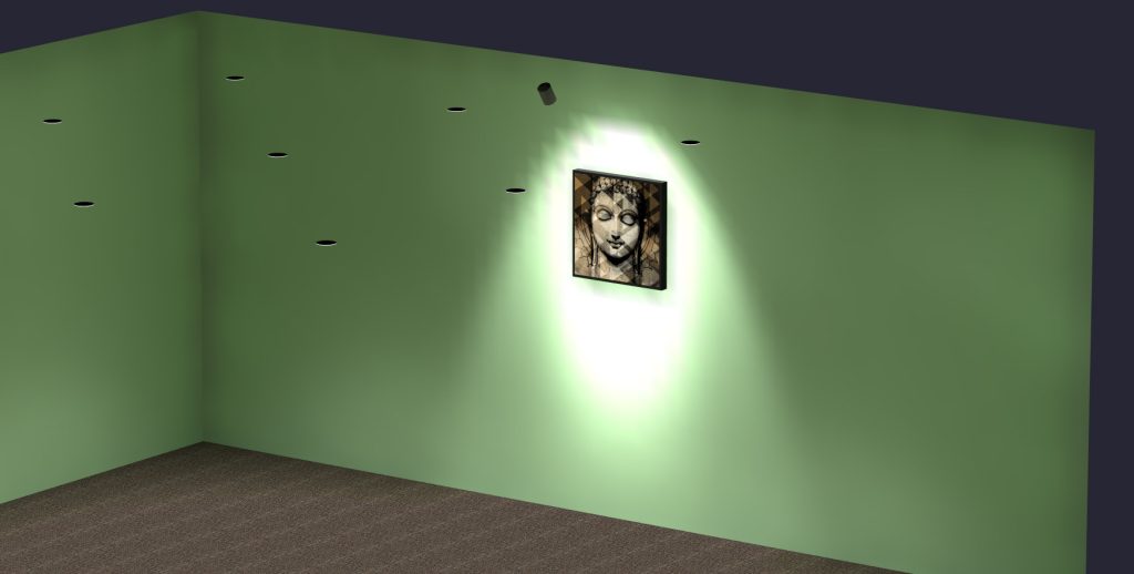
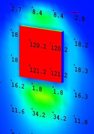
The gallery example shown here provides a very uniform illumination of about 120 foot-candles on the painting, while surrounding illumination is below 20 foot-candles. Because the ratio is 6:1 or greater, the brightness contrast strongly distinguishes the painting on the wall.
There are a number of different options for illuminating artwork, including recessed accent lights, track lights, washes, and frame-mounted lights. One important consideration is that light sources must point at paintings and prints at a roughly 30 degree angle to minimize glare. Because of such specifics, lighting artwork will be covered in greater detail in a future blog article.
